Lightweight research with a big impact

Context

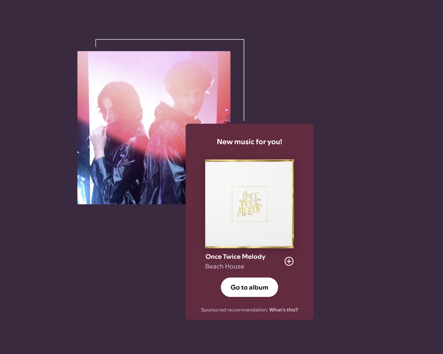
Marquee
Marquee is a full-screen, sponsored recommendation of a new single, EP, or album to listeners. Campaigns booked and managed in Spotify for Artists reach listeners who are most likely to stream an artists promoted release—including both new and existing listeners.
When a listener clicks on a Marquee, they can save the music or go to the new release where they can actively stream.

Showcase
Showcase is a sponsored recommendation on Home that shares an artist’s single, EP, or album to listeners who are most likely to stream their promoted release—including both new and existing listeners.
Artists can promote their entire catalog with a banner that sits where millions of listeners look for their next stream.
Artists and labels can book Marquee and Showcase campaigns via a booking flow on Spotify for Artists.
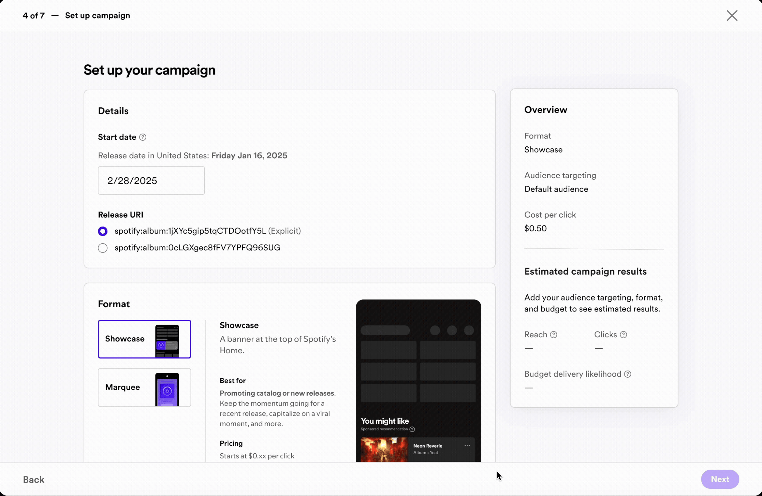
The booking flow UX for Spotify’s promotional tools, Showcase and Marquee, was being redesigned. While conducting usability testing of the prototype an unexpected insight was identified…
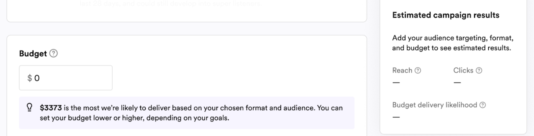
Several users mentioned the tedious process of guessing what budget would work best. Often they input multiple guesses before landing on one what worked.

Problem Space
Users can’t easily set a budget that is likely to spend. Even when customers have a predetermined budget in mind, finding a budget that leads to maximum delivery has been described as a “guessing game.” Plugging-and-playing with the budget field or other inputs adds significant friction to the booking UX, leading to customer frustration and unnecessary time spent on booking.
Additionally, while conducting User Research it was observed that many users play around with budget (as in the gif above) until they land on a number that’s likely to deliver. This leads to a risk that Native Ads is leaving money on the table.
Hypothesis
By bringing max recommended budget into the self-serve flow, we believe we can:
Reduce time spent on booking and improve the customer UX
Increase or maintain average budget per line item
How do we test this hypothesis?
Launch an A/B test.
Measure success based on non-violation of guardrail metrics e.g. average per line item does not decrease
Experiment Results
Overall, booked revenue increased significantly including a 26% increase in average budget line and a 25% increase in budget booked per org, but this came at the cost of a decreased capture rate.

After seeing the initial results, the hypothesis was that either smaller artists, or new orgs that hadn’t booked before, were seeing a suggested budget number that was much higher than they are willing to spend, and abandoning the booking flow entirely instead of booking a lower budget.
We conducted further research with smaller artists to test two treatments.
Research Method
Usability testing of two UI treatments of the max recommended budget step.
Research Questions
Do users clearly understand that they can choose the max likely budget, but it’s an option not a requirement? Does the design clearly communicate what users should do?
Treatment A: Radio buttons

Treatment B: Dynamic banner

Research found that the first UX treatment felt intimidating to smaller artists, while the second treatment felt like the choice was more in their control.
“Seeing that number definitely put me off from using it… I forgot there was even an option to input your own.”
“It feels a lot more like it’s in your hands…”
Small Change
〰️
Big Impact
〰️
Small Change 〰️ Big Impact 〰️
Following research and the success of the experiment, it was decided to rollout the low-lift UX change to 100% which resulted in a big impact.
Product Impact
26% increase in average budget per line item
25% increase in budget booked per org
24% booked budget per release
Financial Impact
Booked revenue: +€11.7M (up from €77M to €85M)
Gross profit:+€10.1M (up from €66M to €73M)
UX Impact
Changed from radio buttons to a dynamically updating informational banner.
This decision aimed to mitigate the loss in capture rate from smaller artists who were intimidated by the radio buttons.